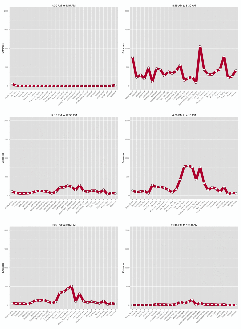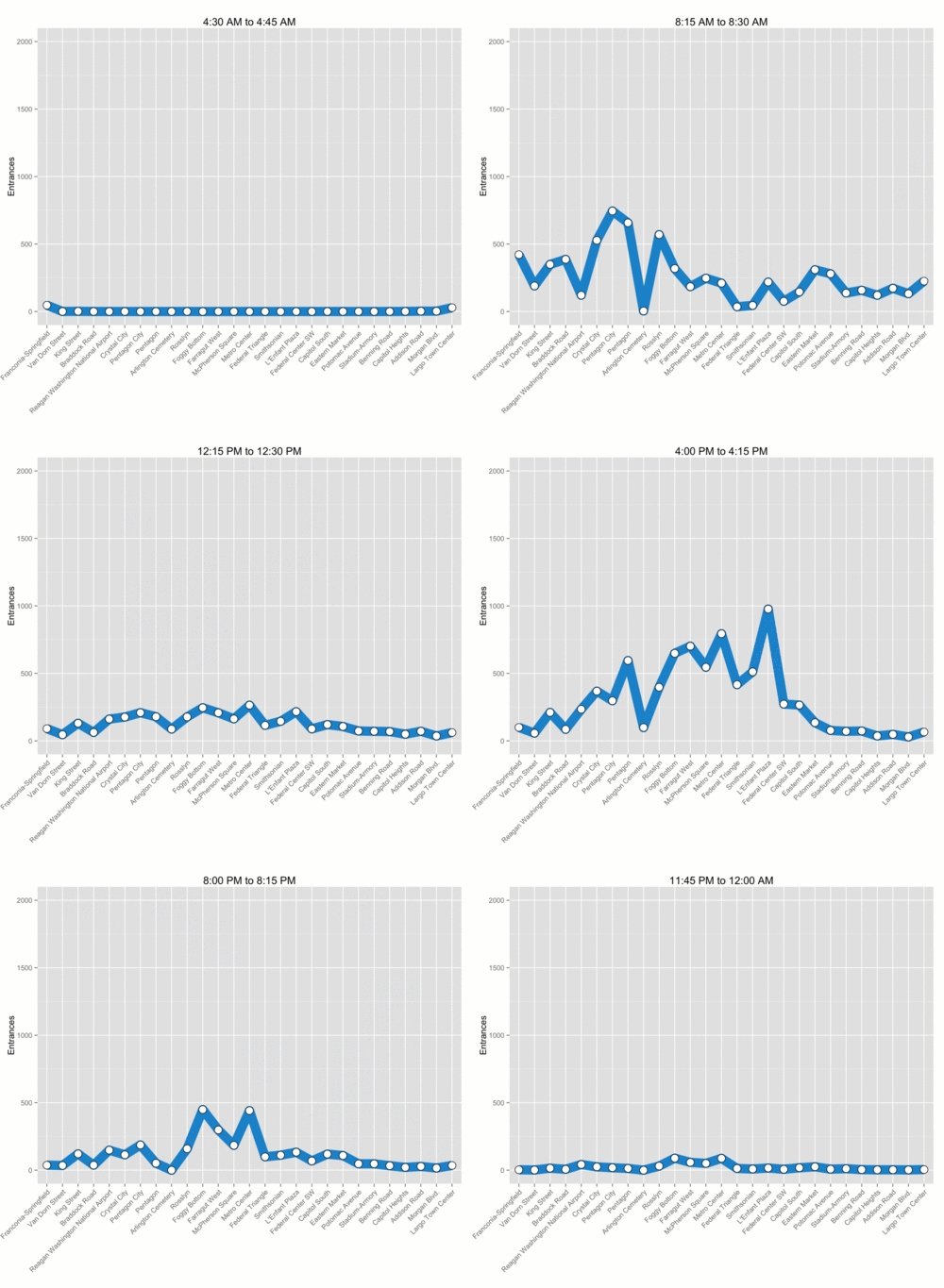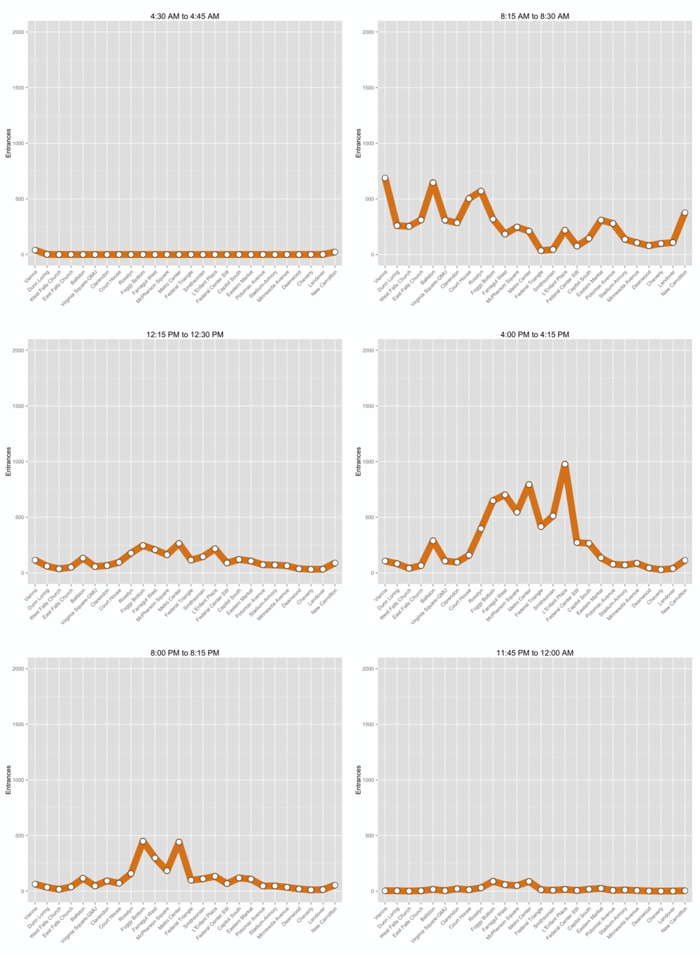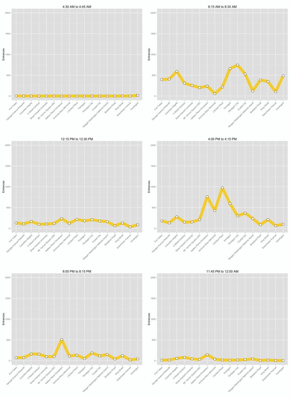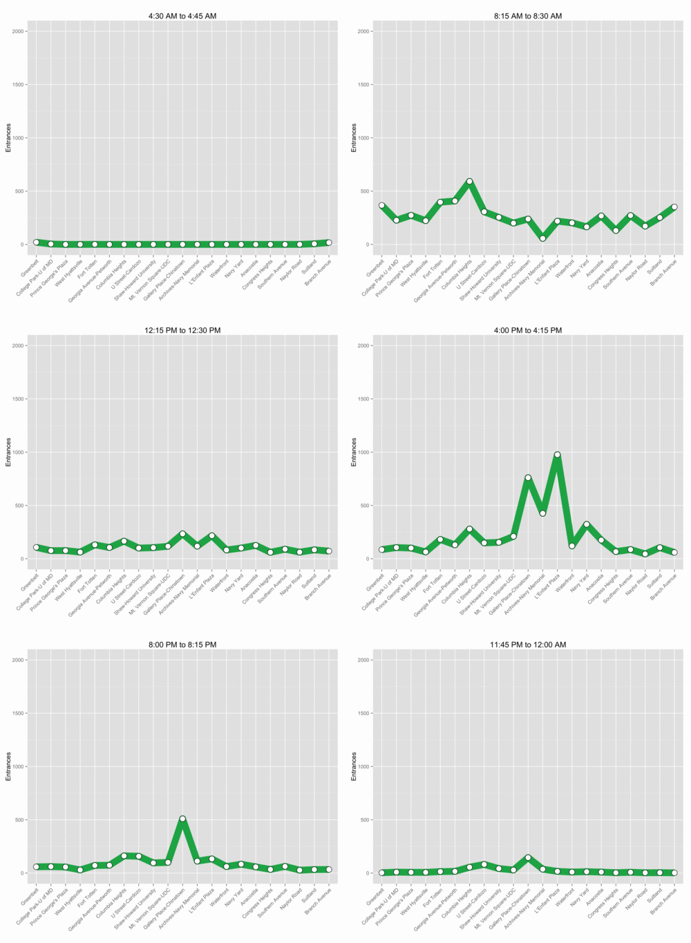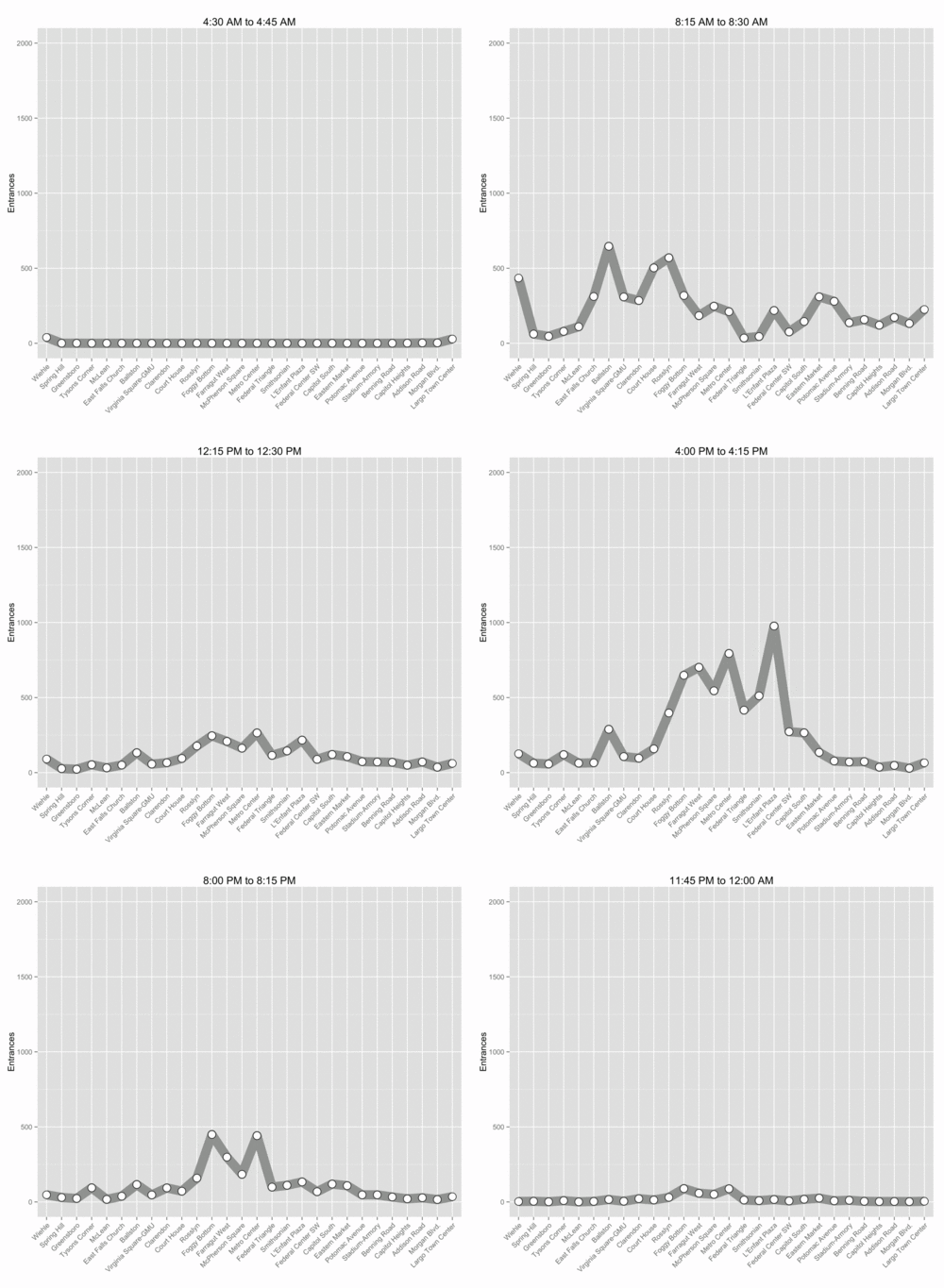
Last month, WMATA’s PlanItMetro blog released another batch of detailed ridership data. We used it to visualize how many people enter each Metro station over the course of a normal weekday.
For each Metro line, we made an animated gif that cycles through fifteen minute intervals from 4:30am to midnight. Each dot on the line represents the average number of riders who entered that station during that time interval on weekdays in October 2015.
Since a lot of people use Metro to commute, many riders enter suburban stations in Virginia and Maryland in the morning. This pattern reverses during the evening rush hour when most riders board trains at downtown stations.
Not all stations follow this trend, though. For example, Ballston has strong ridership during both rush hours since the neighborhood is home to offices and residential buildings alike.
What do you notice in these graphs?
